Clock tower on the UT Tyler campus

Tertiary Component Inventory

The tertiary template is a multi-use template ideal for most pages on your site. The template supports the components below and displays sub-page navigation, contact information, and related links in a right-hand sidebar. The sidebar should generally include sub-navigation but all other features are optional. Content editors should be mindful of the length of the sidebar, and consider other ways to feature content if the sidebar exceeds the length of the primary page content.

Hero

Start the page with an impactful image that is high quality and consistent with your institution's brand. (As seen above.)

Use This Component When:

  • Your page is designed for marketing or storytelling purposes.
  • Your image reflects your brand and will engage site visitors.
  • The hero image will have a light-grey overlay applied to make text placed on the hero accessible.
  • If no hero image is available, the tertiary template can use a blue color block as a background for the H1.

Component Includes:

  • Heading - (1-10 words)
  • Image - 8:3 aspect ratio

Intro Text

Draw attention to a short introductory description for a page.

Use This Component When:

  • You want to draw attention to introductory text to capture visitors, create engagement, and highlight key messaging.
  • Your text is relatively short and doesn’t require links or additional styling such as bolding or italics.
  • Create a cohesive user experience by reserving Styled Intro Text for content at the beginning of a page.

Component Includes:

  • Paragraph text - 10-30 words

Body Paragraph

Use this flexible module for adding headings, body copy, links, and buttons to a page. Powered by a WYSIWYG editor, the paragraph component allows for all standard text formatting options. 

Use This Component When:

  • You have a text-heavy page and need flexible formatting options.
  • Be mindful of the tendency of web visitors to scan content. Use structured headings, short paragraphs, and bulleted or numbered lists to make your content easy to consume online.

Component Includes: 

  • Heading - 1-10 words
  • Paragraph text - Flexible length

Split Column

Utilize the split column module for side-by-side content. The WYSIWYG editor allows you to add headings and buttons to further separate the two columns. Morbi vel nunc dui. Nullam sodales nisi quis nulla efficitur, non auctor arcu volutpat. Praesent nec velit vel eros gravida scelerisque in eget eros. Orci varius natoque penatibus et magnis dis parturient montes, nascetur ridiculus mus. Sed faucibus condimentum semper. Suspendisse quis nulla sapien.

Use This Component When:

  • You want to break up the visual presentation of text by presenting it in two columns.
  • The content you have is relatively short. Long columns will become difficult for web readers to consume.

Component Includes:

  • Heading - 1-10 words
  • Paragraph text - Up to 500 words

Full-Width Image

placeholder
Incorporate images throughout the page to break up text-based modules and offer relevant visuals to the user. Use this component when: you have a strong image that should be the center of attention; your image tells a story without  supporting copy. Component includes: Heading - 1-10 words; Image caption - Up to 30 words; Image - 3:2 aspect ratio.

Video Embed

Showcase a relevant video on the page to increase engagement and provide a visual medium for interpreting information. Use this component when: you want to place a video on your webpage; the Video Embed supports a thumbnail and UI elements from a third-party video player such as YouTube or Vimeo. Clicking “play” starts this video directly in the embed frame. Component includes: Heading - 1-10 words; Caption - Up to 30 words.

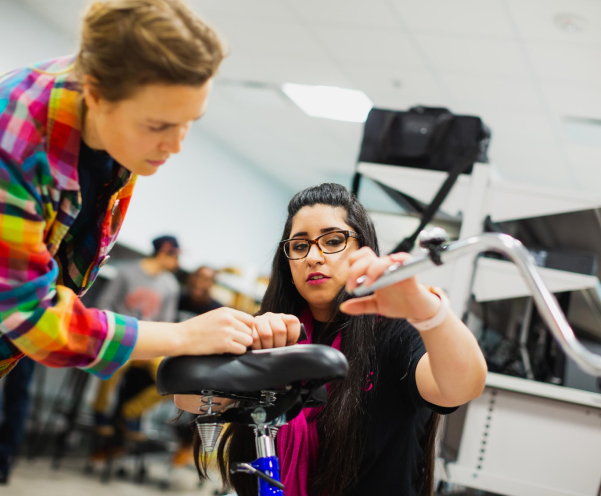
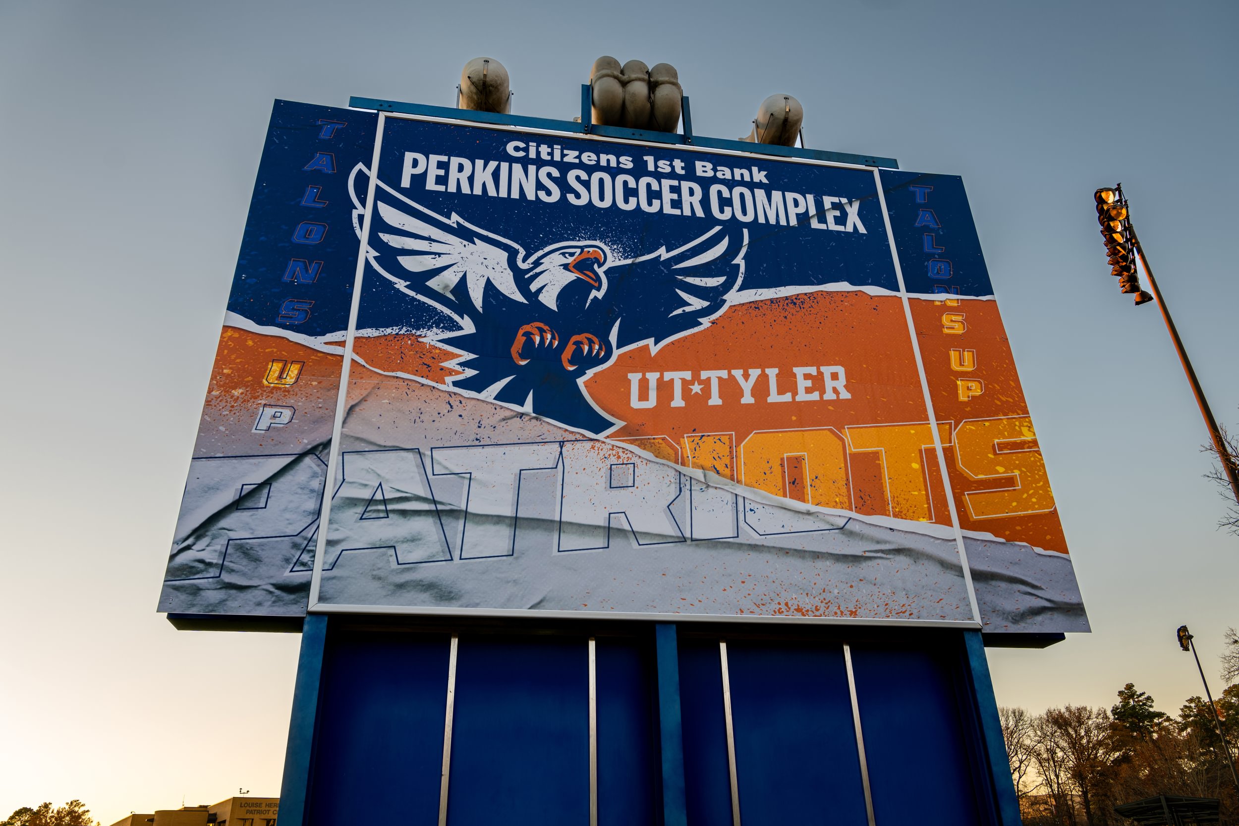
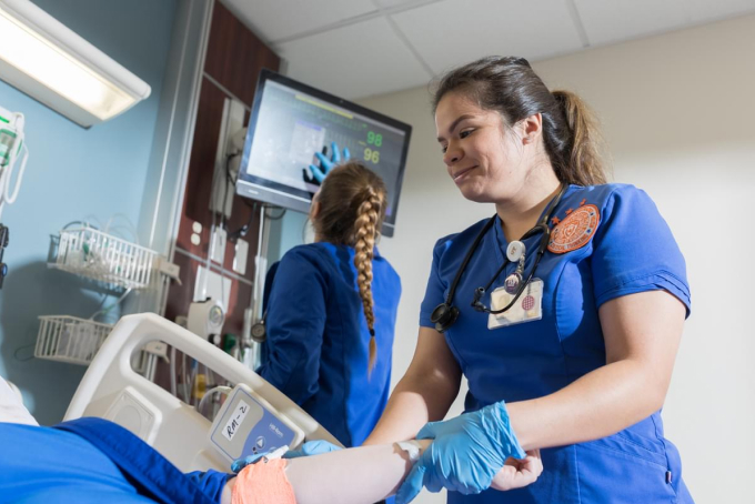
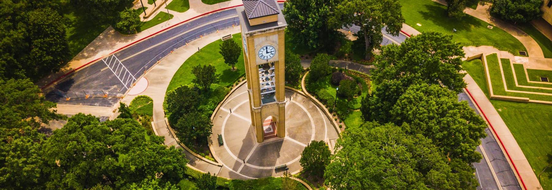
Router List with Image

A visually appealing way to help visitors route to content on other pages within your site. Use this component when: you want to highlight content that routes visitors deeper into the website; you have no more than four links to include; you have a relevant image to support your links. Component includes: Heading - 1-7 words; Supporting copy - Up to 25 words; Link text - 1-5 words; Image - 1:1 aspect ratio.

placeholder

Table

Make important data easy to view with a table.

Use this component when:

  • You are presenting tabular data. Table components should not be used to format text content into rows or columns.
  • We recommend no more than five columns.
  • To make your table accessible, ensure you have properly structured headers for each column - and row, if necessary.

Component includes:

  • Table data

As seen below.

Column Column Column Column
Row $38,282 $38,282 $38,282

News Panel

Incorporate relevant and timely headlines on a page with the news module.

Use this component when:

  • You want to incorporate a feed of recent or relevant news headlines.

Component includes: 

  • Heading - 8-10 words
  • Date
  • CTAs - 1-5 words (optional)

As seen below.

News Panel

Events Panel

Incorporate relevant and timely events on a page with the events module.

Use this component when:

  • You want to include a feed of relevant upcoming events.
  • Your events can link to a supporting page with additional event details.

Component includes: 

  • Date
  • Event Title
  • Time and Location
  • Calls to Action (optional)
  • Featured Event Image: 2:1

As seen below.

Events Panel

May 26

Memorial Day

12 AM - 12 AM

Jun 19

Juneteenth/Emancipation Day

12 AM - 12 AM

Jul 4

Independence Day

12 AM - 12 AM

Aug 9

Summer Commencement

12 AM - 12 AM

Faculty List

Provide contact and biographical information for a faculty or staff member. Use this component when you want a standardized way to display staff and faculty members within or across various divisions at the University of Texas at Tyler. Component can include: Name, Professional Title, Email, Phone, Image - 1:1 aspect ratio

View All Faculty

Michael GangoneAssociate Professor of Civil Engineering

Dr. Gangone’s research focuses on innovative bridge design methods as well as the development of techniques to monitor and assess the safety of highway bridges. He primarily teaches classes in structural engineering.

Amir MirmiranProfessor of Civil Engineering

Dr. Mirmiran is a professor of civil engineering and provost at UT Tyler. His research in bridge engineering has led to two U.S. patents and more than 110 journal publications.

Mena I. SoulimanAssociate Professor

Dr. Souliman is an associate professor in civil engineering with expertise in pavements and transportation materials. He currently teaches graduate and undergraduate courses such as pavement design and analysis and pavement management systems.

Blockquote

“Highlight a student, faculty, or alumni testimonial. Use this component when: you want to draw attention to a compelling quote or testimonial in a news story, a page promoting an important initiative, or a marketing-critical landing page; you don’t have a strong supporting image or want to focus attention on the words rather than the speaker; the Blockquote features options for a white or blue background, and supports carousel functionality. Component includes: Quote - 3-30 words; Attribution - 1-7 words per line; CTA - 1-5 words.”

Student Name | 2024 | Major of Study

Accordion

Optional Accordion Subheading

The Accordion component presents related topics in a condensed format. Examples include FAQs, biographical info, and step-by-step processes.

Use this component when:

  • You have a lot of content and need an organized way to present it.
  • You want to reduce scrolling and make key topics visible by scanning.
  • Your visitors don’t need to see all the content at once.
  • The content you want to display within the accordion is relatively simple.

Component includes:

  • Heading - 1-10 words
  • Supporting copy - Up to 30 words (optional)
  • Item headers - 1-10 words
  • Accordion item copy - Flexible but recommend 3-5 paragraphs maximum.
  • CTA - 3-5 words (optional)

Sorem ipsum dolor sit amet, consectetur adipiscing elit. Etiam eu turpis molestie, dictum est a, mattis tellus. Sed dignissim, metus nec fringilla accumsan, risus sem sollicitudin lacus, ut interdum tellus elit sed risus. Maecenas eget condimentum velit, sit amet feugiat lectus. Class aptent taciti sociosqu ad litora torquent per conubia nostra, per inceptos himenaeos. Praesent auctor purus luctus enim egestas, ac scelerisque ante pulvinar. Donec ut rhoncus ex. Suspendisse ac rhoncus nisl, eu tempor urna.

Call To Action

Optional Accordion Subheading

Sorem ipsum dolor sit amet, consectetur adipiscing elit. Etiam eu turpis molestie, dictum est a, mattis tellus. Sed dignissim, metus nec fringilla accumsan, risus sem sollicitudin lacus, ut interdum tellus elit sed risus. Maecenas eget condimentum velit, sit amet feugiat lectus. Class aptent taciti sociosqu ad litora torquent per conubia nostra, per inceptos himenaeos. Praesent auctor purus luctus enim egestas, ac scelerisque ante pulvinar. Donec ut rhoncus ex. Suspendisse ac rhoncus nisl, eu tempor urna.

Call To Action

Two-Up Panel

Showcase between 2 and 6 related topics with or without supporting links.

Component includes: Group heading - 1-10 words; Section supporting copy - Up to 30 words (optional); Item headings - 1-7 words; Item supporting copy - Up to 30 words; Link - 1-5 words (optional). Item headings can also be links.

Subheading Link (3-5 Words)

Use this component when: you want a way to organize content and links about related topics; your content is succinct and approximately the same length for each topic; text matters more than visuals - two-up panels are great for routing visitors and/or providing explanatory content; two-up panels support linked headers, CTA buttons, or no links. The link style will be consistent within each panel but can vary across different panels.

Subheading Link (3-5 Words)

Component includes: Group heading - 1-10 words; Section supporting copy - Up to 30 words (optional); Item headings - 1-7 words; Item supporting copy - Up to 30 words; Link - 1-5 words (optional). Item headings can also be links.

Subheading No Link (3-5 Words)

Paragraph Text (1-3 sentences) — Sit amet, consectetur adipiscing elit, sed do eiusmod tempor incididunt. Sit amet, consectetur adipiscing elit, sed do eiusmod tempor.

Link (3-5 Words)

Subheading No Link (3-5 Words)

Paragraph Text (1-3 sentences) — Sit amet, consectetur adipiscing elit, sed do eiusmod tempor incididunt. Sit amet, consectetur adipiscing elit, sed do eiusmod tempor.

Link (3-5 Words)

Section Navigation

This component is included on all tertiary pages to provide consistent placement and styling for navigation for site visitors.

  • This component displays in the right sidebar of tertiary pages.
  • We recommend no more than 7 categories. If you have more than 7 categories, consider revisiting your information architecture. Each main category can be expanded to reveal pages that are nested within those categories.

RFI Form

Encourage visitors to request information or connect with your institution with an on-page embedded form.

Use this component when:

  • You want to place a form from a third-party source directly on your website.
  • Your form is short and easy for visitors to complete within the context of a webpage.

Component includes:

  • Form embed code - This component places form fields generated within another system.
  • This component should be used in the right sidebar of tertiary pages.

Contact Card

The contact card highlights a main point of contact, be it an individual or department/office.

Use this component when:

  • You want to provide contact information in a consistent location and style across your website.
  • The Contact Card is displayed in the right sidebar of the tertiary template.

Component includes:

  • Heading - 1-5 words
  • Name/Title
  • Phone
  • Email
  • Paragraph text - up to 20 words (optional)
  • Hours - (optional)

CTA Button

Highlight a call-to-action in a consistent place on a tertiary template.

Use this component when:

  • You want to draw special attention to a key action or link on a tertiary page.
  • This component displays in the right sidebar of the tertiary template.

Component includes:

  • Call-to-Action - 1-5 words each

Related Links

List one or more related links as a way of highlighting relevant resources.

Use this component when:

  • You want to highlight links to other site sections, external websites, or PDFs.
  • You have between 2-5 links to include.
  • This component displays in the right sidebar of the tertiary template.

Component includes:

  • Heading - 1-5 words
  • Link text - 1-5 words